 English |
8 Getting to Know the Web Interface
8.1 Logging into the Web Interface
The main interface of the appliance is the web interface, also called Greenbone Security Assistant (GSA). The web interface can be accessed as follows:
Open the web browser.
Enter the IP address of the appliance’s web interface.
Tip
The appliance’s IP address is displayed on the login prompt of the console or in the GOS administration menu after selecting About and pressing Enter.
Log in using the web administrator created during the setup (see Chapter 5).
8.2 Dashboards and Dashboard Displays
Many pages of the web interface show dashboard displays on the top of the page depending on the page content.
There are two types of dashboard displays: charts and tables.
For each page there is a default setting of displays. The default setting can be restored by clicking  on the right side above the displays.
8.2.1 Adding and Deleting Dashboard Displays
A new display can be added as follows:
Click
 on the right side above the displays.
Select the desired display in the drop-down list (see Fig. 8.1).
Tip
The input box above the selectable options can be used to filter the options.
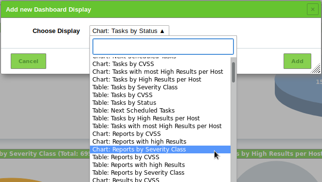
Fig. 8.1 Adding a display
Click Add.
A display can be deleted by clicking  in the upper right corner of the display (see Fig. 8.2).
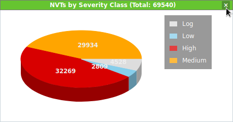
Fig. 8.2 Deleting a display
8.2.2 Editing a Dashboard Display
Depending on the display there are several options which can be selected by moving the mouse to the right edge of a display (see Fig. 8.3):
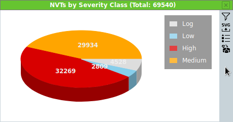
Fig. 8.3 Choosing further options for a display
 Apply a filter to the display. The filter has to be configured for the object type shown in the display.
 Download the chart as an SVG file (only for charts).
 Download the table as a CSV file (only for tables).
 Hide or show a legend (only for charts).
 Switch between 2D and 3D presentation (only for charts).
8.2.3 Organizing Displays in Dashboards
Dashboard displays can be summarized to dashboards. They can be individual compilations of displays but there are predefined dashboards which can be chosen as well.
There can be up to 10 dashboards.
By default, there is only the overview dashboard giving a short overview of tasks, CVEs and VTs (see Fig. 8.4).
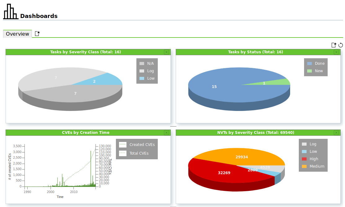
Fig. 8.4 Overview dashboard
The dashboards are displayed by selecting Dashboards in the menu bar.
8.2.3.1 Adding a New Dashboard
A new dashboard can be created as follows:
Click
in the register bar above the dashboard (see Fig. 8.5).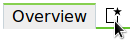
Fig. 8.5 Adding a new dashboard
Enter the name of the dashboard in the input box Dashboard Title.
Select the displays that should be shown by default in the drop-down list Initial Displays (see Fig. 8.6).
The following default settings for the shown displays are possible:
- Default: the dashboard contains the same displays as the overview dashboard.
- Scan Displays: the dashboard contains displays concerning tasks, results and reports.
- Asset Displays: the dashboard contains displays concerning hosts and operating systems.
- SecInfo Displays: the dashboard contains displays concerning VTs, CVEs, and CERT-Bund Advisories.
- Empty: the dashboard contains no displays.
Additionally, already existing dashboards can be chosen.
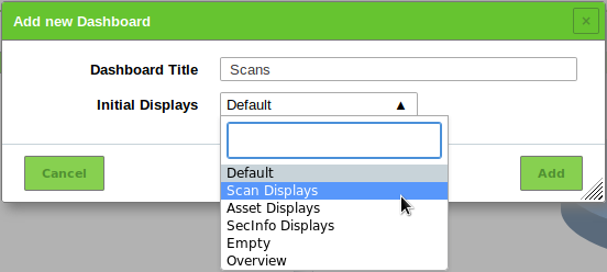
Fig. 8.6 Adding a new dashboard
Click Add.
→ The dashboard is added and shown in the register bar (see Fig. 8.7).
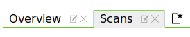
Fig. 8.7 Registers of available dashboards
8.2.3.2 Editing a Dashboard
Displays can be added to or deleted from a dashboard as described in Chapter 8.2.1.
The displays in a dashboard can be edited as described in Chapter 8.2.2.
A dashboard can be renamed as follows:
Click
 in the register of the dashboard in the register bar (see Fig. 8.8).
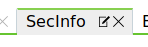
Fig. 8.8 Renaming or deleting a dashboard
Change the name in the input box Dashboard Title.
Click Save.
8.3 Filtering the Page Content
Almost every page in the web interface offers the possibility to filter the displayed content.
8.3.1 Adjusting the Filter Parameters

Fig. 8.9 Filter bar at the top of the page
Multiple filter parameters are combined to form the Powerfilter.
Note
The filter is context aware which means that the filter parameters depend on the currently opened page.
The filter parameters can be entered in the input box in the filter bar (see Fig. 8.9) using the specific syntax of the filter (see Chapter 8.3.2) or be modified as follows:
Click
in the filter bar (see Fig. 8.9).Select and modify the filter parameters (see Fig. 8.10).
Keywords which should be searched for can be entered in the input box Filter.
Note
The Powerfilter is not case-sensitive. All uppercase letters are transformed to lowercase letters before applying the filter.
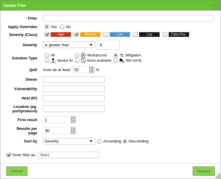
Fig. 8.10 Adjusting the filter
Activate the checkbox Store filter as if the filter should be stored for reuse.
Enter the name for the filter in the input box Store filter as.
Click Update.
→ The filter parameters are applied.
Next to the input box in the filter bar the following actions are available:
 Remove the currently applied filter.
 Update the filter with the current input.
- Reset the filter parameters to the default settings.
- A saved Powerfilter can be applied by selecting it in the drop-down list (see Fig. 8.11).
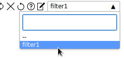
Fig. 8.11 Selecting a saved Powerfilter
Tip
If a specific filter should always be activated on a page, it can be set as the default filter in the user settings (see Chapter 8.7).
Powerfilters can also be created using the page Filters as follows:
Select Configuration > Filters in the menu bar.
Create a new filter by clicking
.Define the name of the filter.
Define the filter criteria in the input box Term (see Chapter 8.3.2).
Select the object type for which the filter should by applied in the drop-down list Type (see Fig. 8.12).
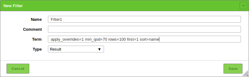
Fig. 8.12 Creating a new filter
Click Save.
→ The filter can be used for the object type for which it was created.
8.3.2 Filter Keywords
When applied, the filter parameters are shown in the lower left corner of the page (see Fig. 8.13).

Fig. 8.13 Applied filter parameters
The filter uses a specific syntax which has to be considered when entering the filter keywords directly in the input box in the filter bar.
Tip
A full list of all filter keywords with possible values sorted by page/object type can be found here.
8.3.2.1 Global Keywords
In general, the specification of the following keywords is always possible:
Note
These keywords apply to the whole filter request and should only be mentioned once.
Example: filter requests like name~test and rows=20 or name~def and rows=30 are not allowed.
In this case, only rows=30 would be applied.
- rows:
Number of rows that are displayed per page. Per default the value is rows=10. Entering a value of
-1will display all results. Entering a value of-2will use the value that was pre-set in My Settings under Rows Per Page (see Chapter 8.7).Note
Using
rows=-1may cause performance issues if large amounts of data have to be processed.If long page loading times are encountered, another filter for the rows should be used.
- first:
Determination of the first object displayed. Example: if the filter returns 50 results, rows=10 first=11 displays the results 11 to 20.
- sort:
Determination of the column used for sorting the results. The results are sorted ascending. Example: sort=name sorts the results by name. The sorting can also be done by clicking the title of the column. After applying the filter, upper cases of the column names are changed to lower cases and spaces are changed to underscores. Typical column names are:
- name
- severity
- host
- location
- qod (quality of detection)
- comment
- modified
- created
Note
sort is not applicable for report details pages (see Chapter 11.2.1).
- sort-reverse:
Determination of the column used for sorting the results (see above). The results are sorted descending.
Note
sort-reverse is not applicable for report details pages (see Chapter 11.2.1).
- tag:
Selection of results with a specific tag (see Chapter 8.4). It can be filtered by a specific tag value (tag=”server=mail”) or only by the tag (tag=”server”). Regular expressions are also allowed.
Note
By filtering using tags custom categories can be created and used in the filters. This allows for versatile and granular filter functionality.
8.3.2.2 Operators
When specifying the components the following operators are used:
=equals, e.g., rows=10~contains, e.g., name~admin<less than, e.g., created<-1w → older than a week>greater than, e.g., created>-1w → younger than a weekregexpregular expression, e.g., regexp 192.168.[0-9]+.[0-9]
The following operators are not supported:
<=>=( )
There are a couple of special features:
If no value follows =, all results without this filter parameter are displayed. This example shows all results without a comment:
comment=
If a keyword should be found but it is not defined which column to scan, all columns will be scanned. This example searches whether at least one column contains the stated value:
=192.168.15.5
The data is usually or-combined. This can be specified with the keyword
or. To achieve an and-combination the keywordandneeds to be specified:modified>2019-01-01 and name=services
andis resolved beforeor, i. e.,x and y or a and b→(x and y) or (a and b)Expressions like
x and (a or b)have to be written asx and a or x and b.Using
notnegates the filter. This example shows all results that do not contain “192.168.81.129”:not ~192.168.81.129
8.3.2.3 Text Phrases
In general, text phrases that are being searched for can be specified.
The following examples show the differences:
overflow- Finds all results that contain the word overflow. This applies to Overflow as well as to Bufferoverflow. Also, 192.168.0.1 will find 192.168.0.1 as well as 192.168.0.100.
remote exploit- Finds all results containing remote or exploit. Of course, results that contain both words will be displayed as well.
remote and exploit- Finds all results containing both remote and exploit. The results do not have to be found in the same column.
"remote exploit"- The exact string is being searched for and not the individual words.
regexp 192.168.[0-9]+.[0-9]- The regular expression is being searched for.
8.3.2.4 Time Specifications
Time specifications in the Powerfilter can be absolute or relative.
- Absolute time specification
An absolute time specification has the following format:
2014-05-26T13h50
If the time is left out, a time of 12:00 am will be assumed automatically. The time specification can be used in the search filter, e.g., created>2014-05-26.
- Relative time specification
Relative time specifications are always calculated in relation to the current time. Time specification in the past are defined with a preceding minus (-). Time specification without a preceding character are interpreted as being in the future. For time periods the following letters can be used:
- s second
- m minute
- h hour
- d day
- w week
- m month (30 days)
- y year (365 days)
For example, entering created>-5d shows the results that were created within the past 5 days. A combination such as 5d1h is not permitted but has to be replaced with 121h.
To limit the time period, e.g., month for which information should be displayed, the following expression can be used:
modified>2019-01-01 and modified<2019-01-31
8.3.3 Examples for Powerfilters
Here are some examples for powerfilter:
127.0.0.1shows any object that has “127.0.0.1” anywhere in the text of any column.127.0.0.1 ianashows any object that has “127.0.0.1” or “iana” anywhere in the text of any column.127.0.0.1 and ianashows any object that has “127.0.0.1” and “iana” anywhere in the text of any column.regexp 192.168.[0-9]+.[0-9]shows any object that has an IP style string starting with “192.168” anywhere in the text of any column.name=localhostshows any object with the exact name “localhost”.name~localshows any object with “local” anywhere in the name.name:^localshows any object with a name starting with “local”.port_list~tcpshows any object that has “tcp” anywhere in the port list name.modified>2019-02-03 and modified<2019-02-05shows any object that was modified between 2019-02-03 0:00 and 2019-02-05 0:00.created>2019-02-03T13h00shows any object that was created after 13:00 on 2019-02-03.rows=20 first=1 sort=nameshows the first twenty objects sorted by the column Name.created>-7dshows any object that was created within the past 7 days.=127.0.0.1shows any object that has “127.0.0.1” as the exact name in any column.tag="geo:long=52.2788shows any object that has a tag named “geo:long” with the value “52.2788”.tag~geoshows any object that has a tag with a name containing “geo”.
8.3.4 Managing Powerfilters
List Page
All existing Powerfilters can be displayed by selecting Configuration > Filters in the menu bar (see Fig. 8.14).
For all Powerfilters the following information is displayed:
- Name
- Name of the filter.
- Term
- Filter terms that form the Powerfilter (see Chapter 8.3.2).
- Type
- Object type for which the Powerfilter can be applied.
For all Powerfilters the following actions are available:
 Move the Powerfilter to the trashcan.
- Edit the Powerfilter.
 Clone the Powerfilter.
 Export the Powerfilter as an XML file.
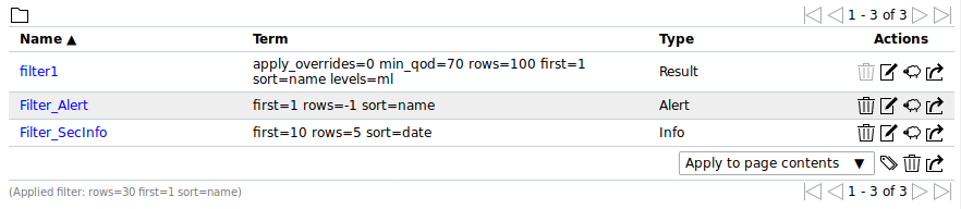
Fig. 8.14 Managing Powerfilters
Note
By clicking or below the list of filters more than one filter can be moved to the trashcan or exported at a time. The drop-down list is used to select which filters are moved to the trashcan or exported.
Details Page
Click on the name of a filter to display the details of the filter. Click  to open the details page of the filter.
The following registers are available:
- Information
- General Information about the Powerfilter.
- User Tags
- Assigned tag (see Chapter 8.4).
- Permissions
- Assigned permissions (see Chapter 9.4).
The following actions are available in the upper left corner:
 Open the corresponding chapter of the user manual.
 Show the list page of all Powerfilters.
- Create a new Powerfilter (see Chapter 8.3.1).
- Clone the Powerfilter.
- Edit the Powerfilter.
- Move the Powerfilter to the trashcan.
- Export the Powerfilter as an XML file.
8.4 Using Tags
Tags are information that can be linked to any object. Tags are created directly with the objects and can only be linked to the object type they are created for.
Tags can be used to filter objects (see Chapter 8.3).
Example: when filtering for tag=target the specific tag must be set. Otherwise, the desired result would not be found.
With tag="target=mailserver" the exact tag with the respective value must be set (see Fig. 8.15).
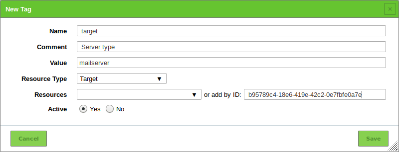
Fig. 8.15 Tag for the object type Target
8.4.1 Linking a Tag to a Single Object
A tag for a single object can be created as follows:
- Open the details page of the object by clicking on the object’s name and clicking .
- Click on the register User Tags.
- Click in the opened section User Tags.
- Define the tag (see Fig. 8.15).
- Click Save.
8.4.2 Linking a Tag to Multiple Objects
A tag can be added to multiple objects of the same type (e.g., tasks, targets, scanners) as follows:
Open the list page of an object type.
Filter the list so that only the objects that should have the tag are displayed.
In the drop-down list below the list of objects select to which objects the tag should be added (see Fig. 8.16).
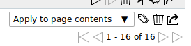
Fig. 8.16 Selecting the objects
Note
Apply to page contents links the tag to all objects which are visible on the current page.
Apply to all filtered links the tag to all objects which are affected by the filter even if they are not visible on the current page.
or
In the drop-down list below the list of objects select Apply to selection.
Activate the checkboxes of the objects that should have the tag in the column Actions.
Click
 below the list of objects.
Select the tag in the drop-down list Choose Tag (see Fig. 8.17).
Note
Only tags which are created for the chosen object type can be selected.
Additionally, a new tag can be created by clicking
.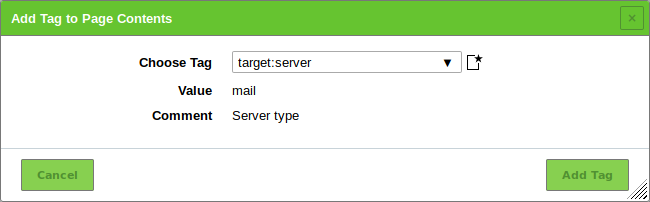
Fig. 8.17 Selecting a tag for multiple objects
Click Add Tag.
8.4.3 Creating a Tag
In addition to linking tags directly to an object, tags can be created on the page Tags and assigned afterwards.
- Select Configuration > Tags in the menu bar.
- Create a new tag by clicking .
- Define the tag. Select the object type for which the tag can be assigned in the drop-down list Resource Type.
- Click Save.
8.4.4 Managing Tags
List Page
All existing tags can be displayed by selecting Configuration > Tags in the menu bar.
For all tags the following actions are available:
 Disable the tag if it is enabled.
 Enable the tag if it is disabled.
- Move the tag to the trashcan.
- Edit the tag.
- Clone the tag.
- Export the tag as an XML file.
Note
By clicking or below the list of tags more than one tag can be moved to the trashcan or exported at a time. The drop-down list is used to select which tags are moved to the trashcan or exported.
Details Page
Click on the name of a tag to display the details of the tag.
Click to open the details page of the tag.
The following registers are available:
- Information
- General information about the tag.
- Assigned Items
- Objects to which the tag is assigned. The objects are only displayed if the tag is enabled.
- Permissions
- Assigned permissions (see Chapter 9.4).
The following actions are available in the upper left corner:
- Open the corresponding chapter of the user manual.
- Show the list page of all tags.
- Create a new tag (see Chapter 8.4.3).
- Clone the tag.
- Edit the tag.
- Move the tag to the trashcan.
- Export the tag as an XML file.
- Disable the tag if it is enabled.
- Enable the tag if it is disabled.
8.5 Using the Trashcan
The page Trashcan is opened by selecting Administration > Trashcan in the menubar. The page lists all objects that are currently in the trashcan, grouped by object type.
Note
Objects in the trashcan do not count as deleted yet. They are only finally deleted when manually deleting them from the trashcan, or when emptying the whole trashcan.
The summary table Content shows all possible types of deleted objects with object counts. By clicking on an object name the corresponding section is shown (see Fig. 8.18).
The trashcan can be emptied by clicking Empty Trash.
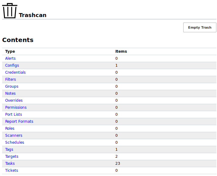
Fig. 8.18 Contents of the trashcan
In the section of the respective object type the single objects can be managed (see Fig. 8.19):
- Clicking
 moves the object out of the trashcan and back to its regular page. The object cannot be restored if it depends on another object in the trashcan.
 - Clicking removes the object entirely from the system. The object cannot be deleted if another object in the trashcan depends on it.
Fig. 8.19 Restoring or deleting a trashcan object
8.6 Displaying the Feed Status
The synchronization status of all SecInfo can be displayed by selecting Administration > Feed Status in the menu bar.
The following information is displayed (see Fig. 8.20):
- Type
- Feed type (NVT, SCAP, CERT or GVMD_DATA).
- Content
- Type of information provided by the feed.
- Origin
- Name of the feed service that is used to synchronize the SecInfo.
- Version
- Version number of the feed data.
- Status
Status information of the feed, e.g., time since the last update.
If a feed update is currently being performed, Update in progress… is displayed. This status is displayed for all feeds, even if only one feed is currently being updated.
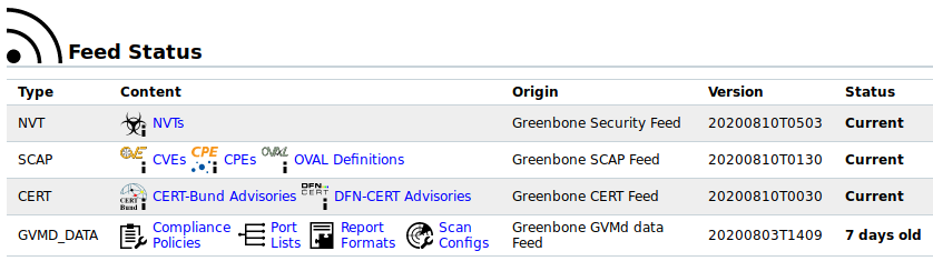
Fig. 8.20 Displaying the feed status
8.7 Changing the User Settings
Every user of the appliance can manage their own settings for the web interface.
These settings can be accessed by moving the mouse over  in the upper right corner and clicking My Settings (see Fig. 8.21).
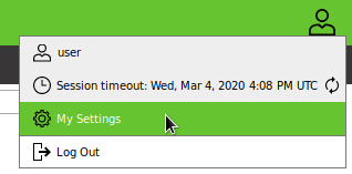
Fig. 8.21 Accessing the user settings
The settings can be modified by clicking .
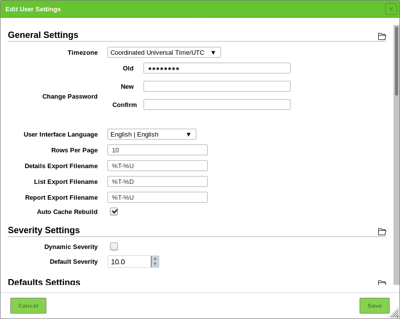
Fig. 8.22 Managing user settings
Important settings are:
- Timezone
- The appliance saves all information in the time zone UTC±00:00 internally. In order to display the data in the time zone of the user, the respective selection is required.
- Change Password
- The user password can be changed here.
- User Interface Language
- The language can be defined here. The browser setting are used per default.
- Rows Per Page
- This defines the default number of objects shown per list page on the web interface. A high number of rows per page increases loading times. Custom user filters may override this setting (see Chapter 8.3).
- Details Export File Name
This defines the default name of the file for exported object details. For the file name the following placeholders can be used:
- %C: the creation date in the format YYYYMMDD. Changed to the current date if a creation date is not available.
- %c: the creation time in the format HHMMSS. Changed to the current time if a creation time is not available.
- %D: the current date in the format YYYYMMDD.
- %F: the name of the used report format (XML for lists and types other than reports).
- %M: the modification date in the format YYYYMMDD. Changed to the creation date or to the current date if a modification date is not available.
- %m: the modification time in the format HHMMSS. Changed to the creation time or to the current time if a modification time is not available.
- %N: the name for the object or the associated task for reports. Lists and types without a name will use the type (see %T).
- %T: the object type, e.g., “task”, “port_list”. Pluralized for list pages.
- %t: the current time in the format HHMMSS.
- %U: the unique ID of the object or “list” for lists of multiple objects.
- %u: the name of the currently logged in user.
- %%: the percent sign (%).
- List Export File Name
- This defines the default name of the file for exported object lists (see above).
- Report Export File Name
- This defines the default name of the file for exported reports (see above).
- Auto Cache Rebuild
- The automatic cache rebuild can be enabled or disabled here. If many actions are performed in a row (e.g., deleting of multiple objects) with enabled automatic cache rebuild, each action triggers the cache rebuild leading to a slowed down process. For such cases, the automatic cache rebuild can be disabled temporarily.
- Dynamic Severity
- This defines whether the severity of an existing result is changed if the severity of the underlying VT changes. Otherwise, the new severity only affects future scans.
- Default Severity
- The default severity can be specified here. In case no severity is assigned to a VT, the default severity is used.
- Defaults Settings
- The default selections or entries for various settings can be specified here.
- Filter Settings
- Specific default filters for each page can be specified here. The filters are then activated automatically when the page is loaded.
8.8 Opening the Manual
The manual can be opened by selecting Help > User Manual in the menu bar.
Additionally, the manual can be opened on any page by clicking in the upper left corner. The chapter related to the page content is opened.
8.9 Logging Out of the Web Interface
Logging out of the web interface can be done by moving the mouse over in the upper right corner and clicking Log Out (see Fig. 8.23).
If no action is performed for a defined period of time, the user is logged out automatically (see Chapter 7.2.4.1.1). The default timeout is 15 minutes.
The remaining time until the user is automatically logged out can be displayed by moving the mouse over .
By clicking the timeout can be reset.
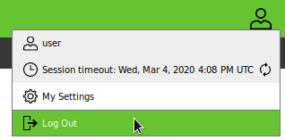
Fig. 8.23 Logging out of the web interface